

Since infographics exploded onto the graphic design scene about 15 years ago, they’ve become a staple for communication in classrooms, in the workplace, and across the web.
But if you’re new to the world of design, the term “infographic” might still be foreign to you.
You might wonder: what is an infographic?
Today, I’ll give you a crash course on infographics and infographic design to answer all of your questions and more. Don’t worry if you’re no designer — I’ll also show you how you can easily customize designs with Venngage’s Infographic Maker and easy-to-edit infographic templates. Or, if you’re looking for an efficient tool to get started, consider using our AI Infographic Generator that creates a infographic from a text prompt in minutes.
What is an infographic?
An infographic is a collection of imagery, data visualizations including different types of charts and graphs like pie charts and bar graphs, and minimal text that gives an easy-to-understand overview of a topic.
It combines two elements: info (meaning information) and graphics (meaning visuals). Simply put, an infographic is a tool that presents information in the form of striking, engaging visuals.
According to the Oxford English Dictionary, an infographic (or information graphic) is “a visual representation of information or data”.
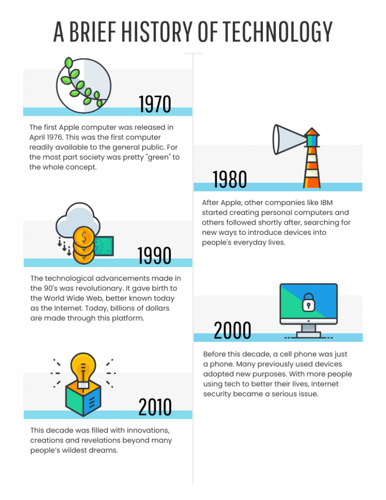
For example, the infographic below shows a brief history of technology using icons, short text blocks and a timeline layout, making it easy to see how technology evolved from the 1970s to the 2010s. These types of infographics work best for showing timelines, milestones, product histories or processes.
Ready to dive right in and create your first infographic? Check out our ultimate infographic design guide for everything you need to get started.
Why should you use infographics?
Infographics are great for making complex information easy to digest. They can be helpful anytime you want to:
- Provide a quick overview of a topic
- Explain a complex process
- Display research findings or survey data
- Summarize a long blog post or report
- Compare and contrast multiple options
- Raise awareness about an issue or cause
When you need to give someone a really quick rundown on something that can be hard to explain in words alone, an infographic is a good way to go.
6 infographic examples for different use cases
Infographics work well for almost any industry to explain tough topics, simplify data or grab your audience’s attention.
Here are some of the examples of infographics for different industries:
- Infographics for education
- Infographics for marketing
- Infographics for government
- Infographics for consulting and freelancing
- Infographics for nonprofits
- Infographics for small businesses and entrepreneurs
Education infographics
Educators use infographics to make content more memorable for students and employees. According to a study, infographics help students retain information better and promote data literacy.
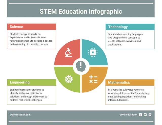
This STEM education infographic, for example, breaks the subject into four color-coded categories, science, technology, engineering and mathematics, with a short explanation of what students learn in each area.
Need to explain a complex process? Our process infographics can help communicate complex processes clearly.
Infographics can be useful whenever you need to communicate information quickly, or any time you want to make an impact with your data or your message.
Marketing infographics
You can use marketing infographics to visualize latest industry trends, marketing tips, product comparisons, case studies and customer results, or promote an event or webinar with key details in one visual.
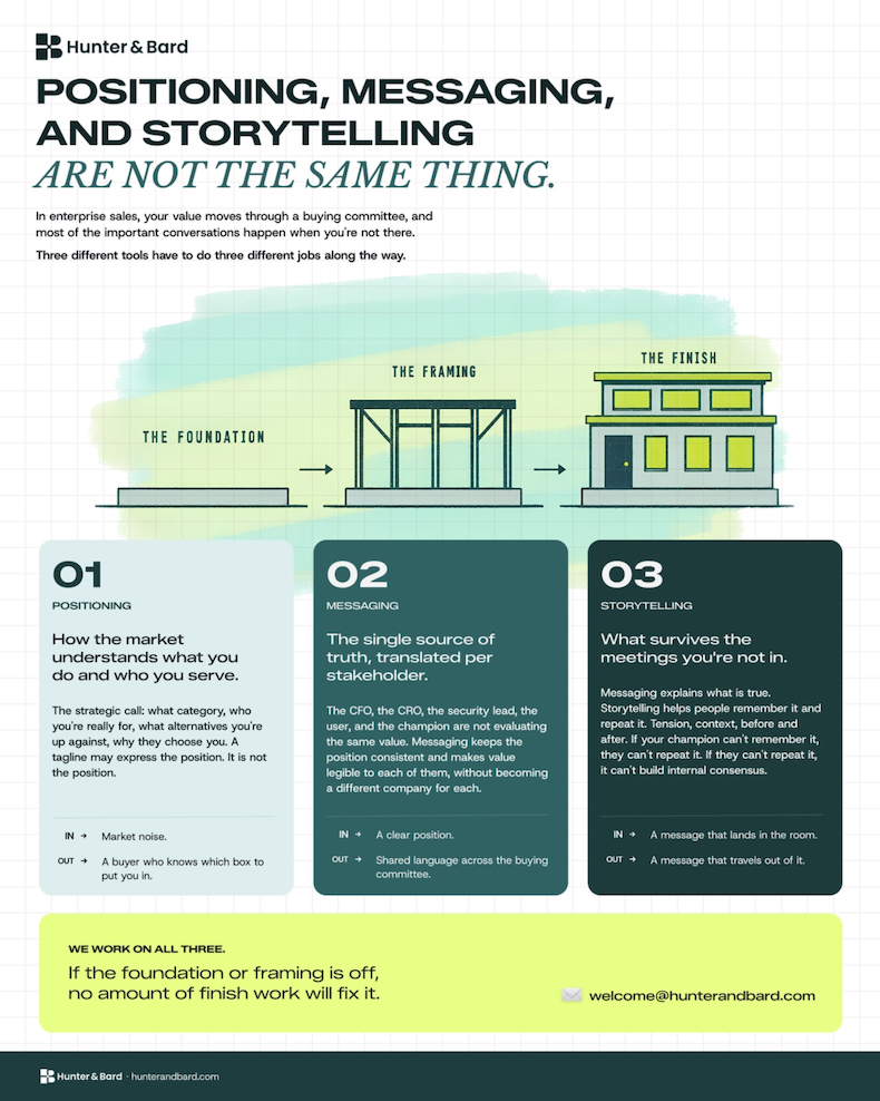
Let’s take an example of this infographic by Hunter & Bard, a B2B marketing consultancy. It explains the difference between positioning, messaging and storytelling. The building metaphor (foundation, framing, finish) show how the three concepts build on each other so readers can clearly understand how they work together.
Source: Hunter & Bard
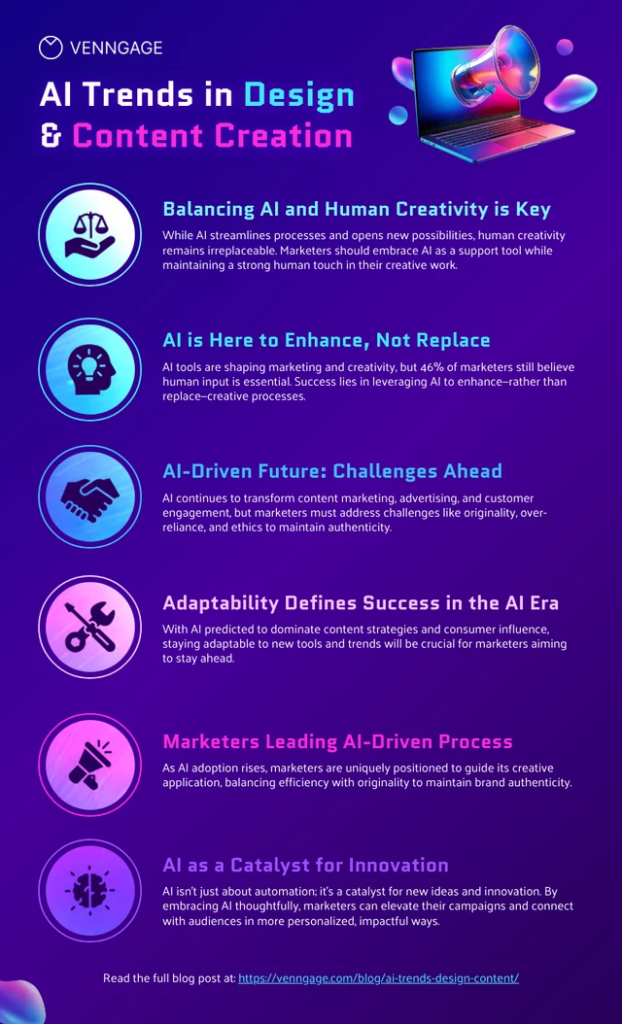
Look at this infographic on AI trends in design and content creation that summarizes six key trends on how marketers use AI. Each section pairs a heading with a short explanation, so anyone can get the full picture without reading a 2,000-word article. You can add this to a blog post, use as a social media graphic, or include in an email newsletter.
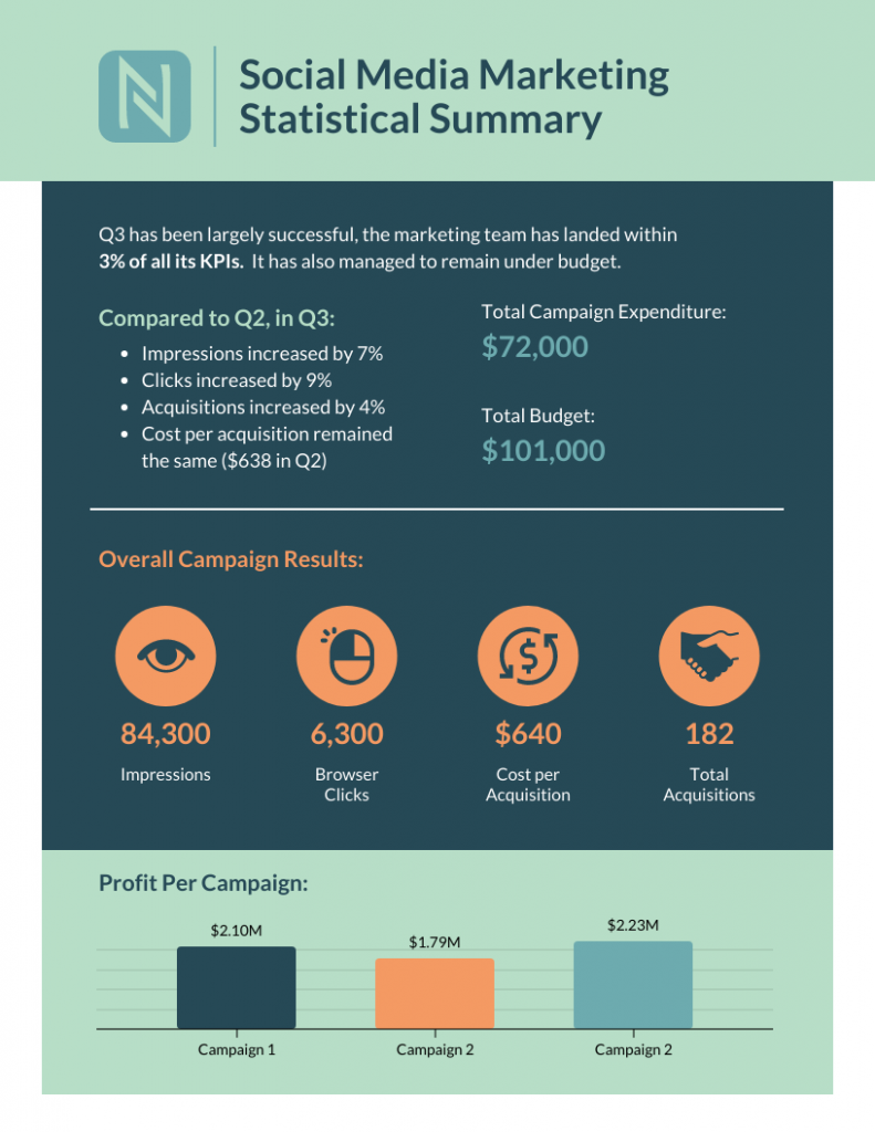
You can also use infographics to visualize data from marketing campaigns and present it to the stakeholders. For example, marketing highlight summary template show campaign performance and results using icons and bar charts.
Here are some of the best use cases for marketing infographics:
- Showcase your business’s achievements on a landing page or downloadable one-pager
- Send a visually striking email newsletter to deliver news, showcase a new product or service or demonstrate thought leadership
- Improve their online courses or course handouts
- Drive interest on social media. Share snippets on Instagram or the full infographic on Pinterest.
- Make a roundup infographic. Collect quotes from influencers, compile them into an infographic and write a blog post on that.
- Summarize key points in a white paper or ebook.
Informational infographic examples, like this one about the effect of excess sodium, are great for educating a variety of audiences.
Government infographics
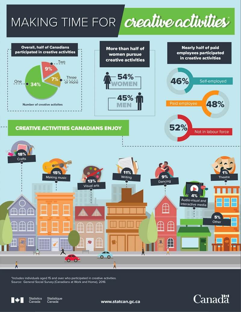
In the government sector, infographics are used for sharing statistics and census data, like in this visual from the Government of Canada:
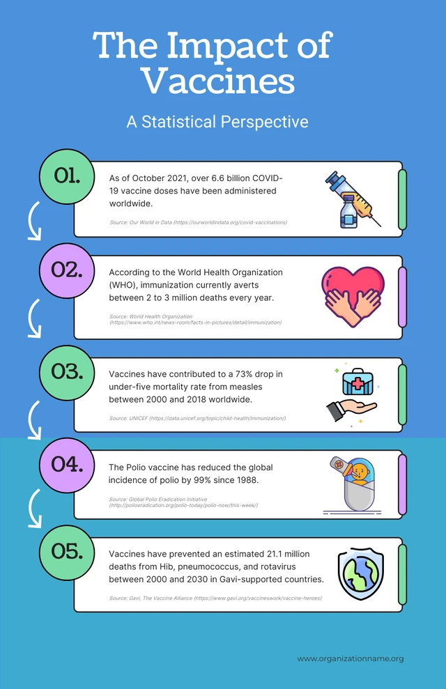
Government agencies can also use infographics to spread useful healthcare information, such as vaccine infographics which promote accurate vaccine information and increase vaccination rates. Here’s an example:
Consulting and freelancer infographics
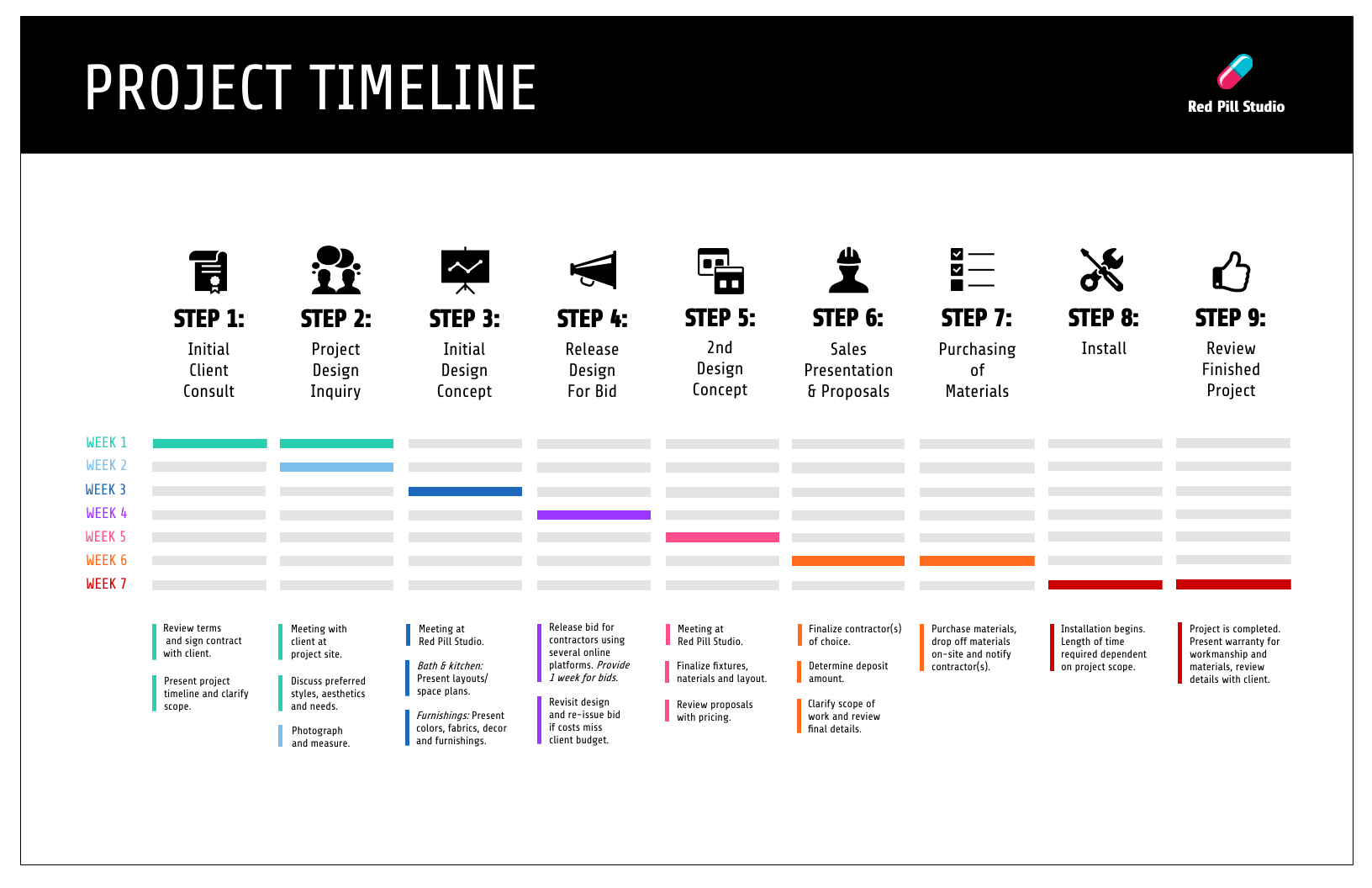
Consultants use timeline infographics to visualize project timelines and to simplify new or industry-specific topics to their clients:
Consultants use infographics to:
- Present data in a fresh way in client presentations
- Strengthen your argument and visualize timelines in client proposals
- Deliver progress reports to clients. Include an infographic in your report to visualize project timelines or progress “by the numbers”
Nonprofit infographics
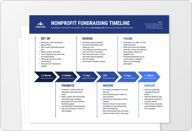
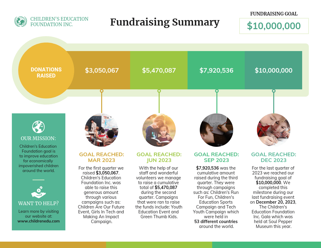
Nonprofits use infographics to promote events and raise awareness for their causes or to showcase their successful fundraising efforts.
If you run a non-profit organization, you can use infographics to:
- Promote awareness about a cause
- Plan a campaign strategy
- Show the impact of a fundraiser that can be sent to donors in an email
- Highlight results in an annual report
- Showcase successes in an impact report or case study
- Visualize information in crisis communications
Small business and entrepreneurship infographic examples
Small businesses and entrepreneurs use infographics to reach new audiences and increase brand awareness:
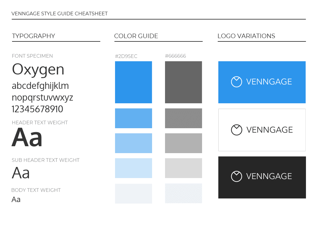
This brand style guide cheat sheet is a great infographic example for small businesses. It’s visual and compact, which helps readers absorb the information faster.
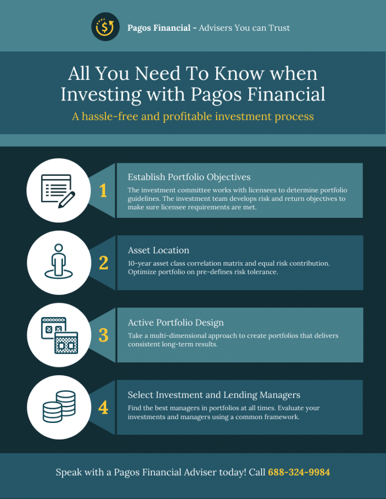
Infographics are a great tool for small businesses to explain their process and build trust with potential customers. The below infographic for a financial advisory firm breaks down the four-step investment process into a simple numbered layout.
Instead of burying that information in a long services page or a PDF brochure, you can share this infographic on your website or emails to give prospective clients a clear picture of how the firm works.
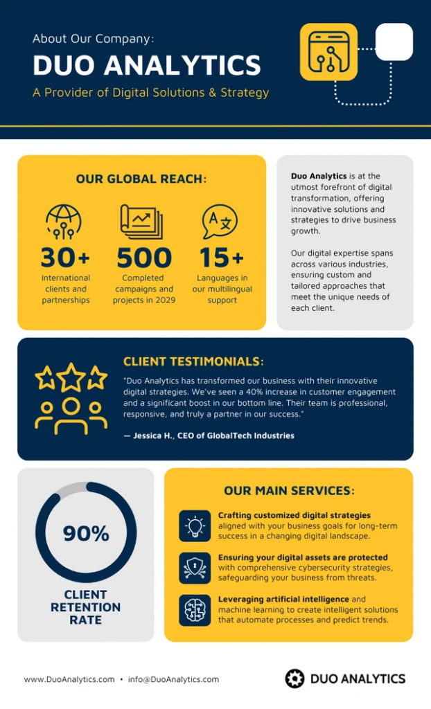
As a small business owner, you can also create an ‘About Us’ infographic like the one shared below and add it to your website, social media pages or pitch deck. Since most people skip the About Us page on a website, an infographic is a more engaging way to communicate what you do and build brand awareness.
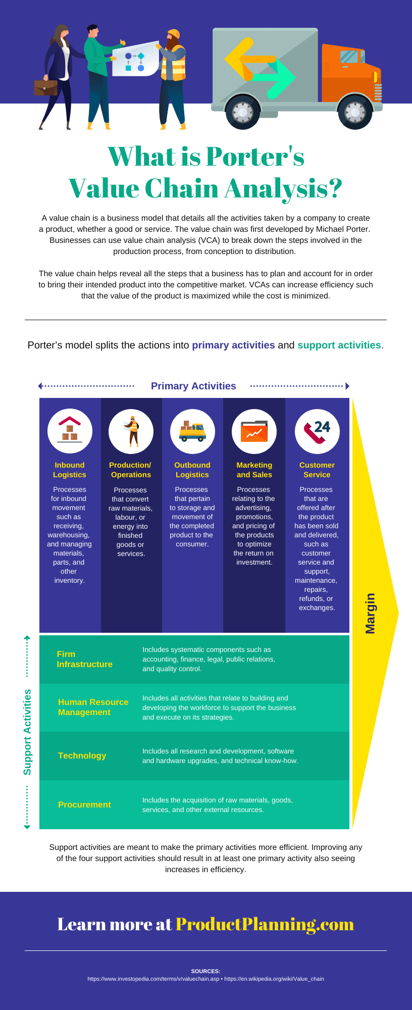
A business may also want to visualize processes and activities. This infographic example on supply chain analysis could easily have been a boring document. Instead, the topic is covered more thoroughly and succinctly in an infographic:
Small businesses and entrepreneurs can use infographics to:
- Create their brand style guide
- Highlight their offerings and past successes in flyers and brochures
- Promote their business or demonstrate thought leadership on social media
- Better showcase products/services and past successes on their website’s sales page or in a downloadable one-pager
- Showcase your company’s history on their website’s about page
- Send creative newsletters
What are the different types of infographics?
At Venngage, we have various infographic types, each serving different purposes and suited for different kinds of data and information. However, here are some 9 common types of infographics:
- Statistical infographics
- Informational infographics
- Timeline infographics
- Process infographics
- Geographic infographics
- Comparison infographics
- Hierarchical infographics
- List infographics
- Resume infographics
This video summarizes these 9 types of infographics and when to use them:
Each type of infographic is tailored to visualize a different type of content.
Informational infographics
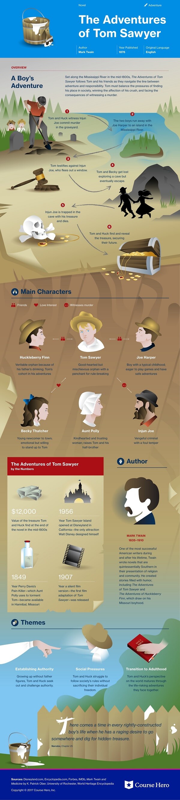
Informational infographics are used to explain complex topics in a clear and structured way. They often contain more text than other infographic types, making them ideal for educating audiences on detailed subjects or step-by-step processes.
Like this example from Course Hero below, informational infographics work best as summative, standalone pieces providing a high-level explanation of a topic.
Source: Course Hero
Many informational infographics also explain something niche in a simple manner. These are handy to have as visual references for unfamiliar and complex topics.
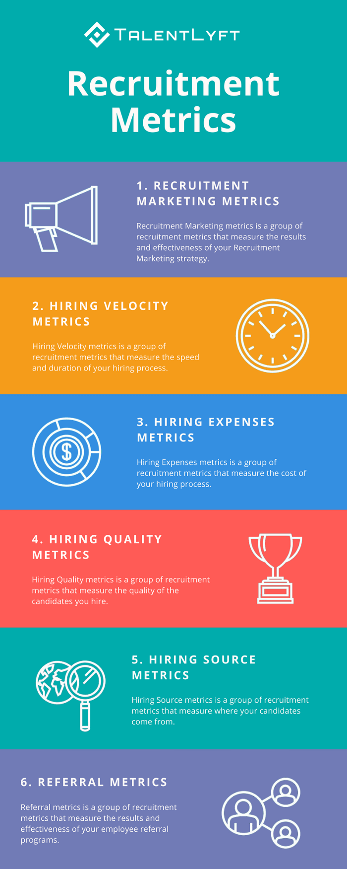
TalentLyft’s infographic on recruitment metrics is a great example. It provides a short and sweet summary of the six key recruitment metrics hiring managers should understand and track.
Source: Talentlyft
Statistical infographics
You’ll see statistical infographics mostly in reports, presentations or research papers. They’re great for visualizing numbers as charts, graphs or bold callout stats, making data more engaging.
Compared to informational infographics, statistical ones contain much less text and narrative flow. Instead, they make a statement with big numbers and standalone facts.
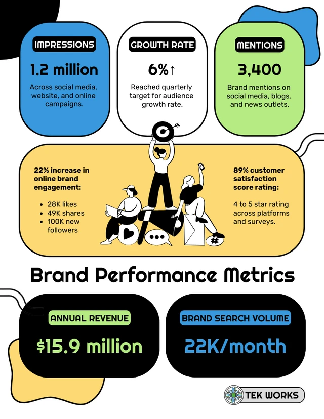
This brand performance infographic, for example, skips the charts entirely and uses large highlighted numbers and color-coded sections to present key metrics like impressions, growth rate and brand mentions.
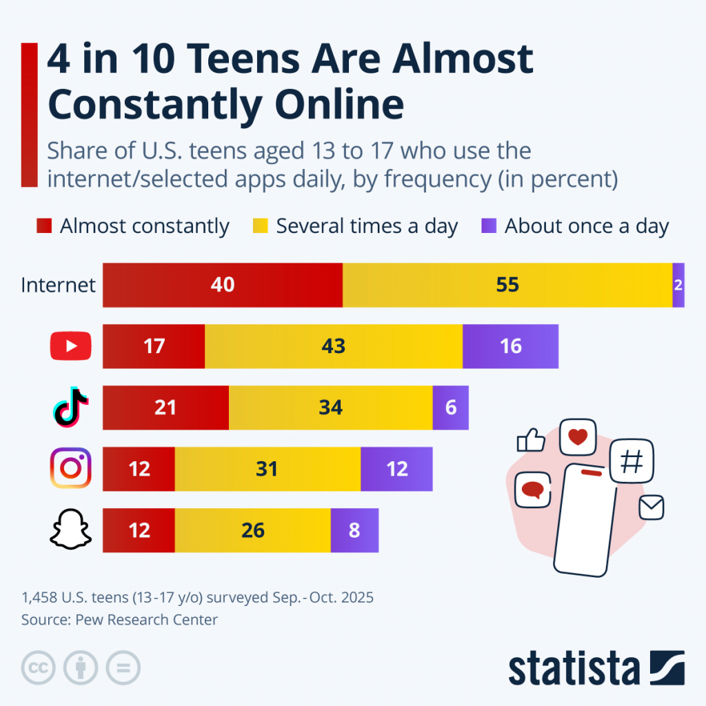
This infographic from Statista uses a stacked bar chart to break down how often U.S. teens use the internet and social media apps daily.
Source: Statista
How do I create an infographic?
Our step-by-step guide on how to create an infographic is your go-to resource for designing an infographic. But before you dive in, start by creating an infographic outline.
Step 1: Organize your information with an infographic outline
Creating an outline will help you organize your thoughts and create a clear and engaging infographic.
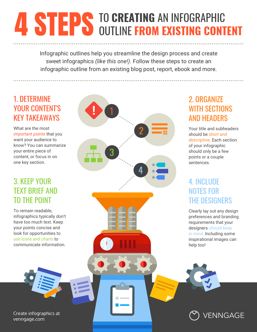
Create an infographic outline from existing content using these 4 steps:
- Identify the key takeaways of your content
- Decide the title, headers, subheaders, and facts
- Consider the length of paragraphs and points
- Include notes and references for the design, such as the layout, icons, chart types, etc.
Step 2: Pick an infographic template or generate an infographic using AI
Once the outline is ready, there are two ways to design an infographic:
- Select an infographic template and edit it
- Generate the design using an AI infographic generator
Let’s understand how the two options work.
Select an infographic template
This is one of the most common methods to design an infographic. All you have to do is find an existing infographic template as per the type of infographic you want to generate, the theme, layout, industry, size, etc.
For example, if you want to design a social media infographic, you need a creative or bold template with a striking layout that stands out on social media platforms.
Venngage offers a large library of professional infographic templates. You can browse by category and pick a template that fits your topic or campaign.
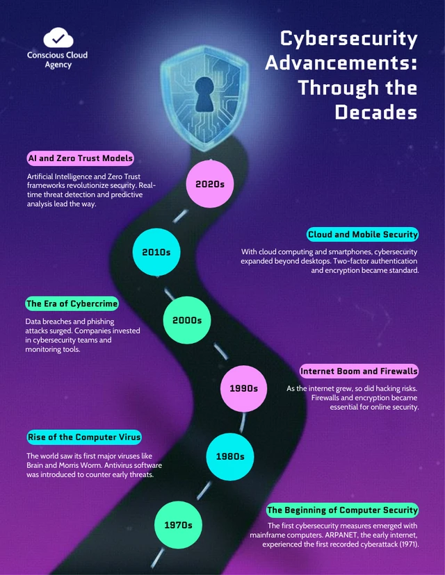
Pre-made infographic templates (like the one below) can give you the design inspiration you need to get your infographic rolling. Even just using them as a jumping-off point can be helpful.
Use an AI infographic generator
The easiest way to generate an infographic today is to use an AI design tool like Venngage’s AI Infographic Generator.
Instead of spending time browsing the library and searching for the perfect template for your content, all you need to do is write a text prompt describing your infographic idea and Venngage AI will turn it into a customizable infographic.
It automatically picks the best layout, icons and color and even adds relevant copy to the infographic based on your prompt.
Here’s an example of an infographic on how to reduce carbon footprint created using Venngage’s AI Infographic Generator.
Prompt:

Result:

Note: If you want better control over the design and prefer to select a template first, Venngage AI lets you easily edit a template too. This way, you get a design that’s much closer your infographic idea and saves manual editing.
Prompt:

Result:

3. Customize your infographic
Once your design is ready, whether from a template or generated with AI, you can customize the colors, fonts, icons, text and layout to fit your brand and topic.
With Venngage, you can do most of this through AI. The editor has a chatbot where you type the change you want in plain language and the AI applies it. For example, I asked it to suggest different color palettes for my design, and it generated a few options I could apply in one click.

Here’s what else you can do with AI in the editor:
- Use AI chat to make changes: Describe what you want adjusted in plain language, like a layout or style change, and the AI applies the edit directly.
- Generate icons and images with AI: Create custom icons and visuals that match your topic instead of searching a stock library.
- Apply a consistent style throughout: Keep icon styles, spacing and layout uniform across the whole design automatically.
- Edit the copy with AI: Tighten, rewrite or adjust the tone of your text without leaving the editor.
- Apply your Brand Kit: Add your logo, brand colors and fonts across the entire design in one click.
Want more information about creating infographics? This video guide will show you how you can make an infographic in just 5 steps:
What are the 5 elements of an infographic?
The five key elements of an infographic are:
- Visual hierarchy: A clear structure that guides the reader’s eye through the information, ensuring the most important points stand out. This includes layout, typography, and emphasis on key data.
- Data & facts: Accurate, well-researched data presented in a digestible way. Charts, graphs, and statistics help make complex information more accessible.
- Graphics & icons: Visual elements like icons, illustrations, and images that support the content and make the infographic engaging without overwhelming the message.
- Color & typography: A consistent color scheme and easy-to-read fonts that enhance readability and maintain brand alignment while making the infographic visually appealing.
- Concise messaging: Short, impactful text that gets straight to the point. Infographics should simplify information rather than overwhelm readers with long paragraphs.
What makes an infographic design effective?
An effective infographic design combines several key elements:
- Clarity: The message should be easy to understand at a glance. Avoid clutter and focus on the most important information.
- Visual hierarchy: Use size, color, and positioning to guide the viewer’s eye through the content in a logical order, highlighting key points.
- Engaging visuals: Incorporate icons, images, and charts that are not only relevant but also visually appealing, making the information more memorable.
- Simplicity: Keep the design clean and avoid overwhelming the viewer with too much detail. Stick to a few key visuals and concise text.
- Consistent style: Use a consistent color scheme, font choices, and layout that align with your brand or message.
- Data accuracy: Ensure that any data presented is accurate, well-researched, and clearly cited, if necessary.
- Audience focus: Design with your target audience in mind, considering their preferences, knowledge level, and what they need to take away from the infographic.
Here are some simple tips to create infographics that are both clear and eye-catching.
For more design ideas, check out our post on 7 ways to customize your infographic template!
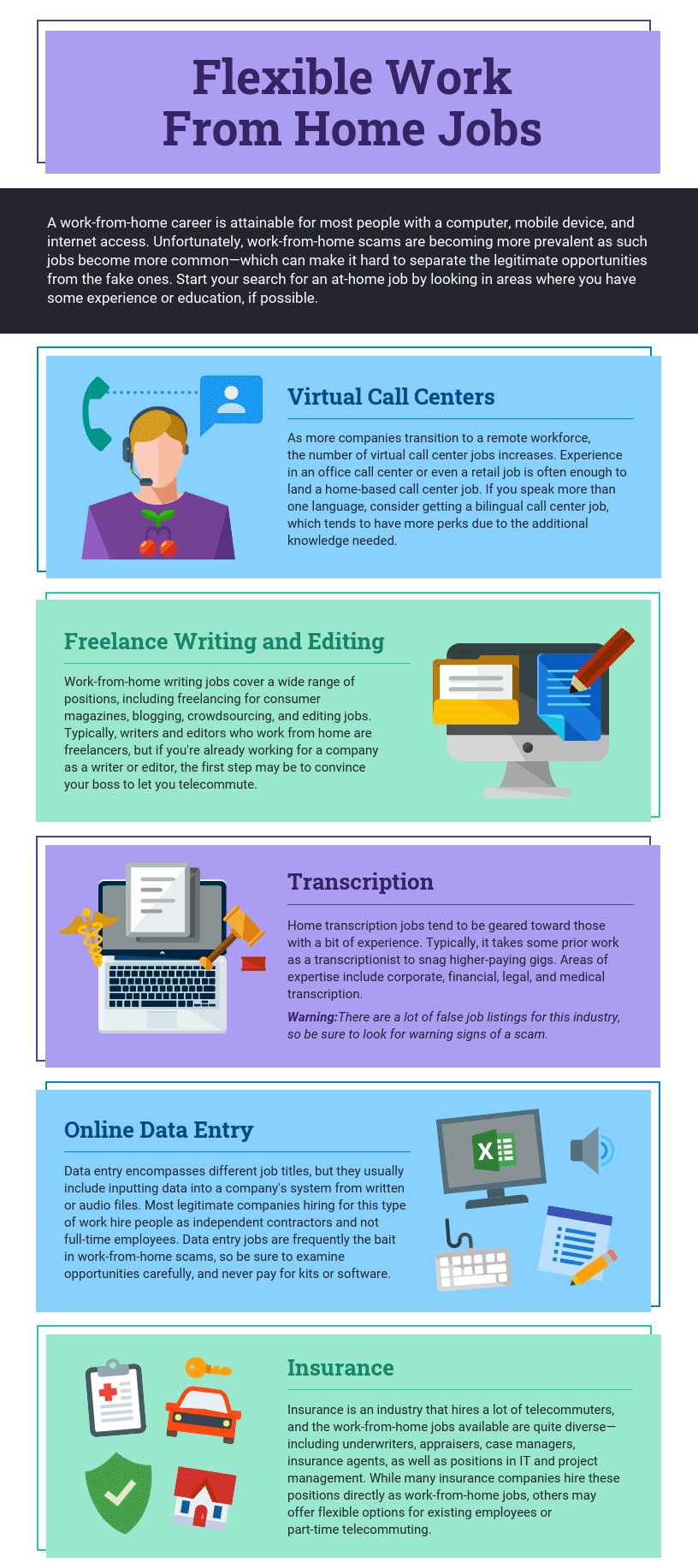
Where you place and group elements on a page affects how readers understand your graphic. Using simple design elements like borders, lines, and shapes helps organize content and makes it easier to read.
For example, grouping related items in a shape can break the design into clear sections like in the example below:
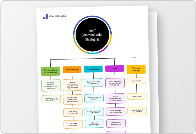
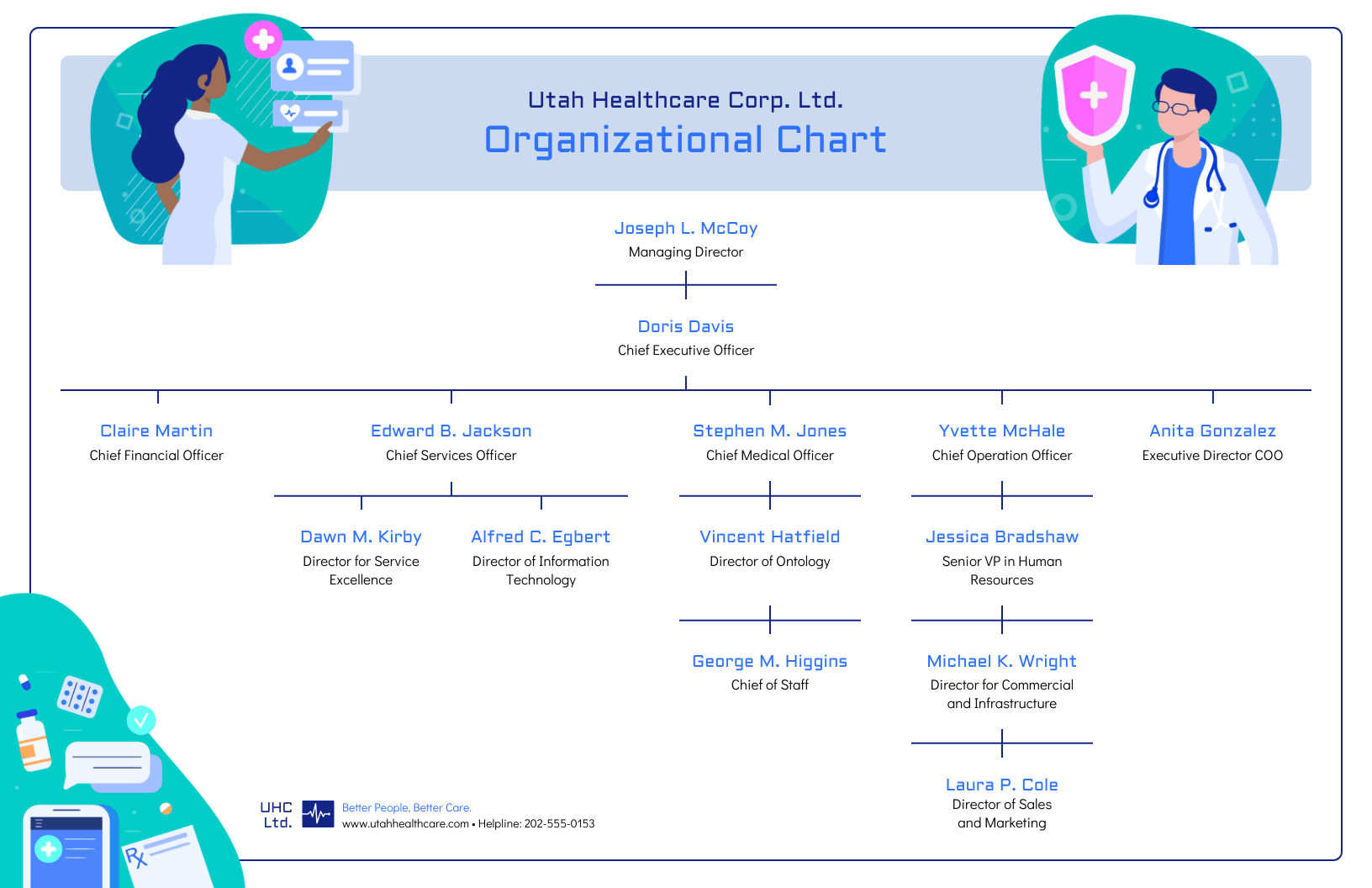
Alternatively, when the structure of the information is the main focus of the infographic (like in an organizational chart or a flow chart) it can be helpful to explicitly connect related elements with lines. Like in this marketing flow chart infographic:
Want more tips on organizing your information in an infographic? Check out our step-by-step guide on how to summarize information and present it visually.
Use contrasting colors to guide your readers’ attention
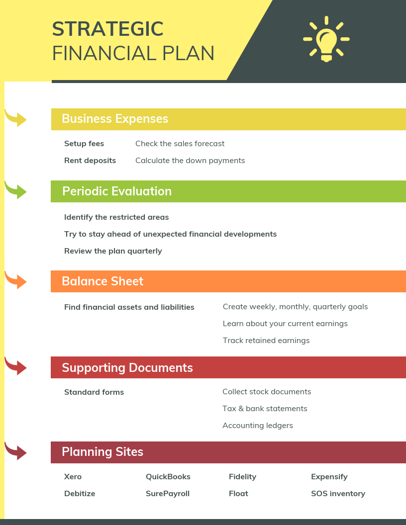
Color is a key design element that goes beyond making infographics visually appealing. It can help group information, like in the business strategy infographic example below.
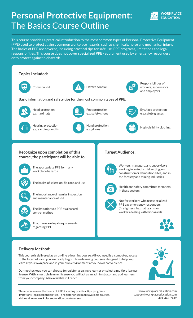
Color can also highlight key points while fading out less important details. Use one contrasting color to make important info stand out. For example, the bright teal icons in the infographic below stand out against the white background.
Need some infographic color scheme inspiration? Check out our guide on how to pick colors for infographics.
Create a text hierarchy with three different font styles
The key to using fonts correctly in infographics is to create a clear text hierarchy with three different font styles–one for the main heading, one for the section headings, and one for the body text.
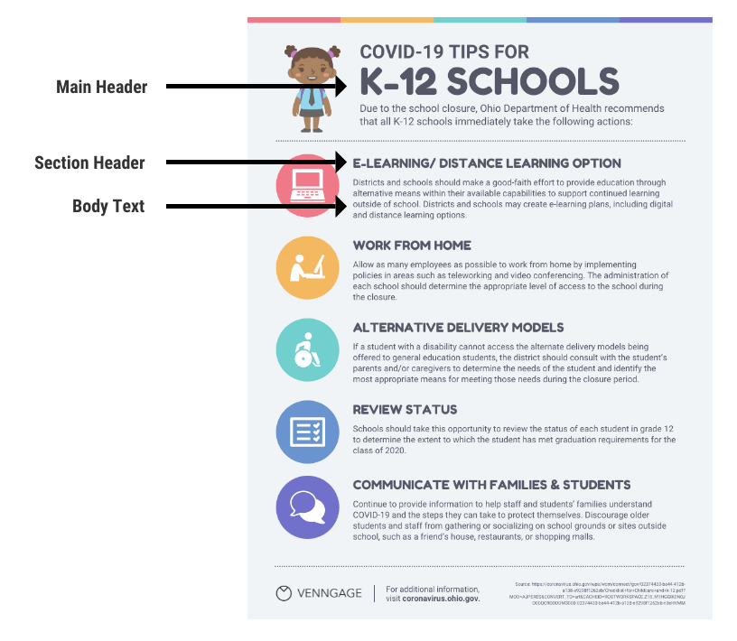
The main header font is the largest and most stylized, setting the tone. Section headers are smaller and simpler, but still stand out while the body text is the smallest and easy to read.
Check out our roundup of popular fonts for guidance.
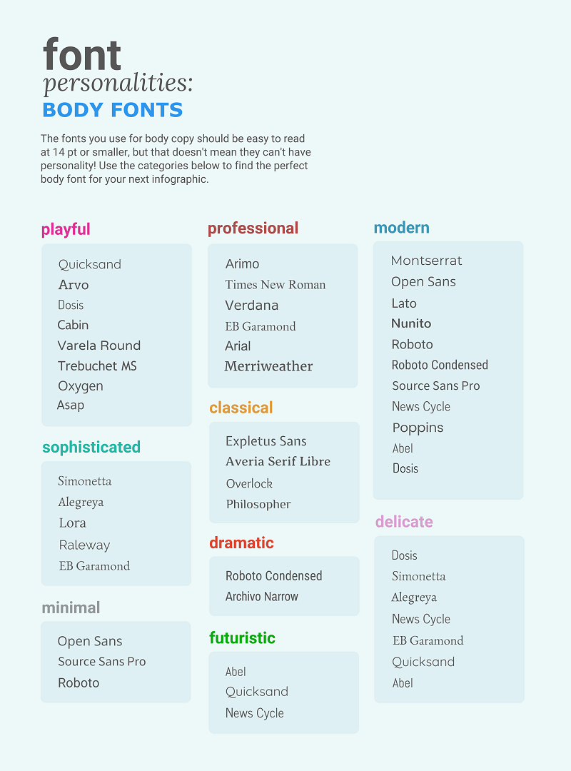
Not sure which fonts are readable? Here’s a quick guide to the best options for body text:
For more infographic font tips and best practices, check out our guide all about choosing infographic fonts.
Use images, icons, and illustrations to make key takeaways memorable
Last but certainly not least, make sure that the focus of your infographic is on visuals like images, symbols, icons, illustrations, and data visualizations like charts and graphs.
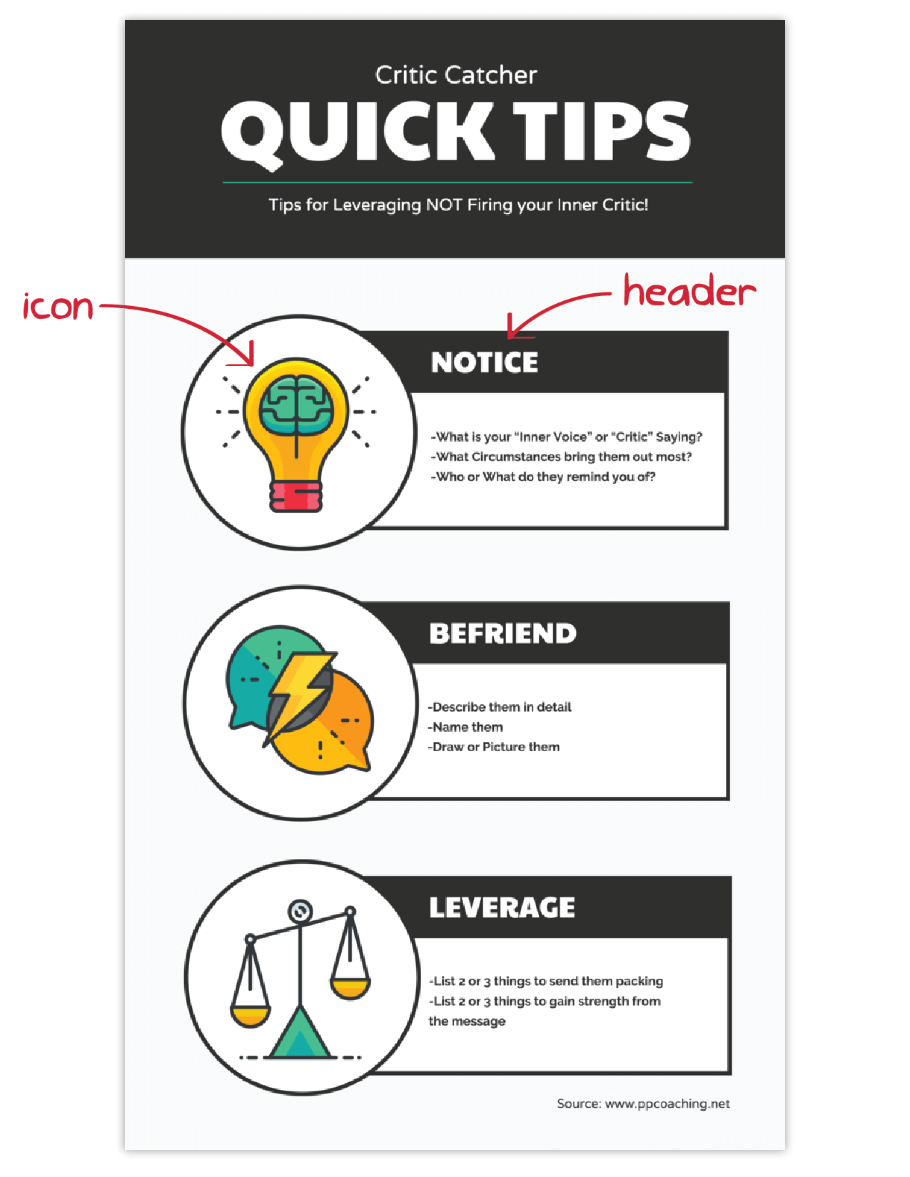
Visuals are crucial for making your information engaging and memorable. The easiest way to make sure you have enough visuals in your graphic is to add an icon to represent each header, as seen in the example below:
Or even better, create visual examples of each main point in the infographic, as seen in this sample infographic from Elle & Company:
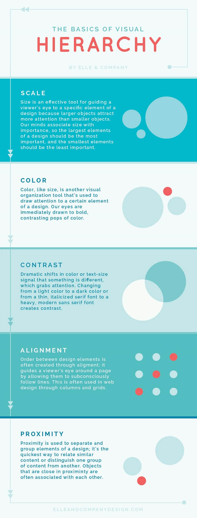
It’s important to have fun with your design, too. It doesn’t need to be strictly business and serious.
Making a data-heavy infographic and need help visualizing your data? Check out our guides on designing effective charts and choosing the best charts for your infographic.
Making a data-heavy infographic and need help visualizing your data? Check out our guides on designing effective charts and choosing the best charts for your infographic. And remember, if you’re working with graphics‑heavy programs, choosing the right software can make the difference between smooth performance and frustrating slowdowns.
What is the importance of using visual elements in an infographic?
The use of visual elements in an infographic can help enhance the overall effectiveness of the communication. Here are some key points highlighting the importance of using visual elements in an infographic:
- Enhanced comprehension: Visual elements, such as graphs, charts and illustrations can simplify complex information, making it easier for the audience to understand the data presented.
- Improved retention: Human beings tend to remember visual information more effectively than text alone. By incorporating visual elements, infographics can improve the retention of information, ensuring that the key points are more likely to be remembered by the audience.
- Increased engagement: Visual elements in infographics make the content more engaging and appealing. People are naturally drawn to visuals, and the use of color, images and graphics can capture the audience’s attention, encouraging them to spend more time interacting with the information.
- Facilitated comparison: Infographics often involve the presentation of data sets, comparisons or contrasts. Visual elements can effectively facilitate such comparisons, enabling the audience to discern patterns, trends and differences more easily.
- Universal understanding: Visual elements can transcend language barriers, making infographics a powerful tool for communicating with diverse audiences across different cultural and linguistic backgrounds.
- Aesthetic appeal: Infographics that are well-designed and visually appealing are more likely to be shared and distributed widely, especially in the context of social media and online platforms. Aesthetically pleasing visual elements can attract more attention and help the infographic reach a broader audience.
- Storytelling: Visual elements can contribute to the storytelling aspect of an infographic, allowing for the creation of a narrative that flows logically and is visually engaging. By combining text and visuals, infographics can effectively communicate a compelling story or message.
In summary, the use of visual elements in infographics is critical for conveying complex information in a more accessible and engaging manner, enhancing comprehension, improving retention, and increasing overall audience engagement and appeal.
FAQs about creating infographics
What does infographic mean?
An infographic is a visual tool that combines images, charts and text to present information clearly and engagingly. Infographics simplify complex ideas, making them easy to understand at a glance.
What is an infographic example?
An infographic example is a visual way to present information. It uses elements like images, icons, text, charts, and diagrams to communicate messages quickly and effectively.
What is the purpose of an infographic?
The purpose of an infographic is to present information and data visually, making complex concepts clear, engaging and easier to understand.
Are infographics limited to one page?
Infographics are not limited to one page and can vary in length. That said, they are often designed to be concise and easily digestible, frequently fitting on a single page for optimal accessibility.
What are infographics used for?
Infographics are used to simplify complex information, making it easier to understand at a glance. They’re commonly used for:
- Data visualization: Displaying statistics and trends.
- Process explanations: Breaking down steps or workflows.
- Comparisons: Highlighting differences between options or concepts.
- Education: Teaching concepts or summarizing information.
- Marketing: Communicating product features, benefits, or company facts.
- Reports: Summarizing key findings or insights visually.
Do I need design experience to make an infographic?
No. Most infographic tools come with ready-made templates you can edit, so you don’t have to design anything from scratch. You just replace the placeholder content with your own text, colors and icons. And if you don’t want to start from a template at all, you can use an AI infographic generator that builds the first draft for you based on a prompt.
Can AI create an infographic for me?
Yes. A tool like Venngage’s AI Infographic Generator turns a text prompt into a structured infographic in seconds. You describe what you want, and it generates the layout, adds relevant copy and picks the icons and colors for you. From there, you can edit anything you want to fit your topic or brand.
What are the five types of infographics?
The five common types of infographics are:
- Statistical infographics: Focus on visualizing data and statistics using charts, graphs, and numbers to highlight trends or key insights.
- Informational infographics: Present detailed information or instructions, often using icons, illustrations, and text to explain a concept or process.
- Timeline infographics: Display events or milestones in chronological order, making it easy to follow the progression of a story or project.
- Comparison infographics: Show the similarities and differences between two or more items, often using side-by-side visuals or charts.
- Process infographics: Break down a series of steps or stages in a process, often using flowcharts or arrows to guide the viewer through the information.
Do you need quantitative data to make an infographic?
No, you don’t always need quantitative data to create an infographic. While infographics often include data like numbers and statistics, they can also be used to present qualitative information such as:
- Processes: Steps in a workflow or guide.
- Comparisons: Differences or similarities between ideas or concepts.
- Timelines: A sequence of events or milestones.
- Concept explanations: Visual representations of abstract ideas.
In these cases, visuals like icons, illustrations, and text can effectively communicate the message without relying on numbers. So, while data is common, it’s not a requirement for every infographic.
Turn your ideas into an infographic
An infographic turns information into a visual that people can understand at a glance. The best ones use a mix of text, images and data to inform and engage.
Now that you know what an infographic is and the different ways it’s used, the next step is to create one. You can start with a template if you already have a layout in mind, or describe your idea in a prompt and let AI handle the first draft. Either way, you’ll get a fully editable design you can customize to fit your topic and brand.
Not a designer? No problem. You can create your infographic today with Venngage’s templates, or skip straight to a finished draft with our AI Infographic Generator.