

Comparison infographics make it easier to compare products, plans, data, ideas or even changes over time without asking readers to work through a long list of information.
But they need more than two columns placed side by side. The layout should make it easy to compare the same criteria, spot the important differences and understand the main takeaway at a glance.
In this guide, I’ll share 20 comparison infographic examples and templates to differentiate products, pricing plans, pros and cons, data and before-and-after results. I’ll also show you how to choose the right format and create your own comparison infographic or comparison chart.
What is a comparison infographic?
A comparison infographic shows similarities or difference between two or more subjects, products, ideas, concepts or data points in a visual format. This type of infographic usually uses side-by-side columns, charts, icons or other design elements to make similarities and differences easier to see.
For example, this viral vs. bacterial infection infographic uses a simple two-column layout to compare the two types of infections using the same criteria: common examples, treatment and whether antibiotics work.

Source: Fallbrook Medical Center
The leadership comparison infographic below is more detailed. It uses a four-column layout to compare different leadership styles based on their characteristics, advantages, disadvantages and when to use them. It also uses simple icons to make each section easier to scan, such as a thumbs-up for advantages and a thumbs-down for disadvantages.

Want to learn how to create comparison infographics in detail? Watch this video.
Product and services comparison infographics
You can tell someone your product is better… but most people won’t believe it until they see it with their own eyes. That’s where good product comparison infographic comes in.
1. Product feature comparison infographic template
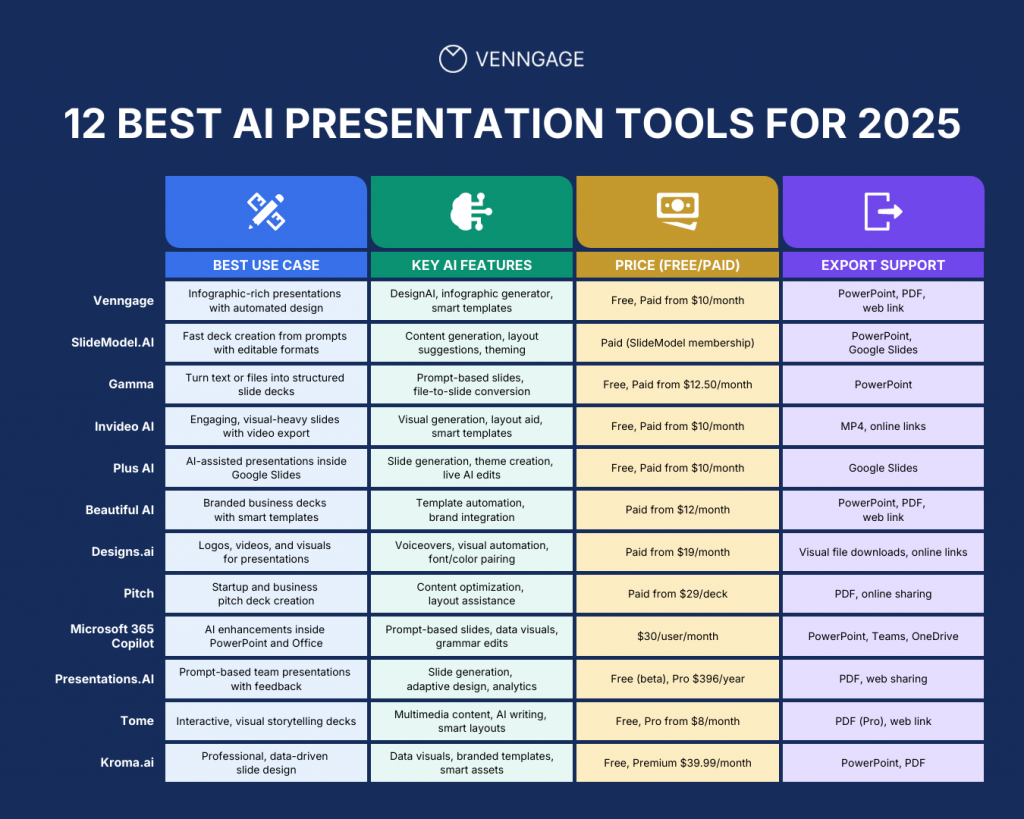
This AI presentation tools infographic compares 12 products using the same four criteria: best use case, key AI features, pricing and export support. The table format makes it easier to compare each tool across different category. If you want to compare several tools at once, a comparison table infographic works best
2. Side-by-side product comparison template
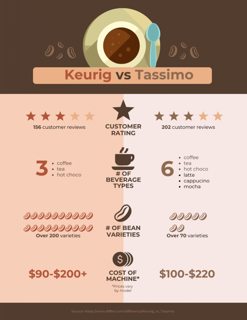
If you are comparing just two products, you can use a side-by-side comparison template like this one. It lists the criteria down the middle of the infographic, so readers can quickly see how each product differs in areas like ratings, features, variety and price.
This type of chart can be useful to highlight the superiority of a product you’re selling, or to help people pick the best product for their needs.
3. Services comparison infographic template
If you’re choosing between several service providers, you’ll usually want to know the same things about each one: what features they offer, what’s missing and how they compare overall.
This website builder infographic does exactly that. It compares five platforms across features like SSL security, mobile apps, live chat and multiple editors, then adds an overall rating at the bottom. The check marks make it easy to scan without turning the comparison into a wall of text.

4. Competitor performance comparison infographic template
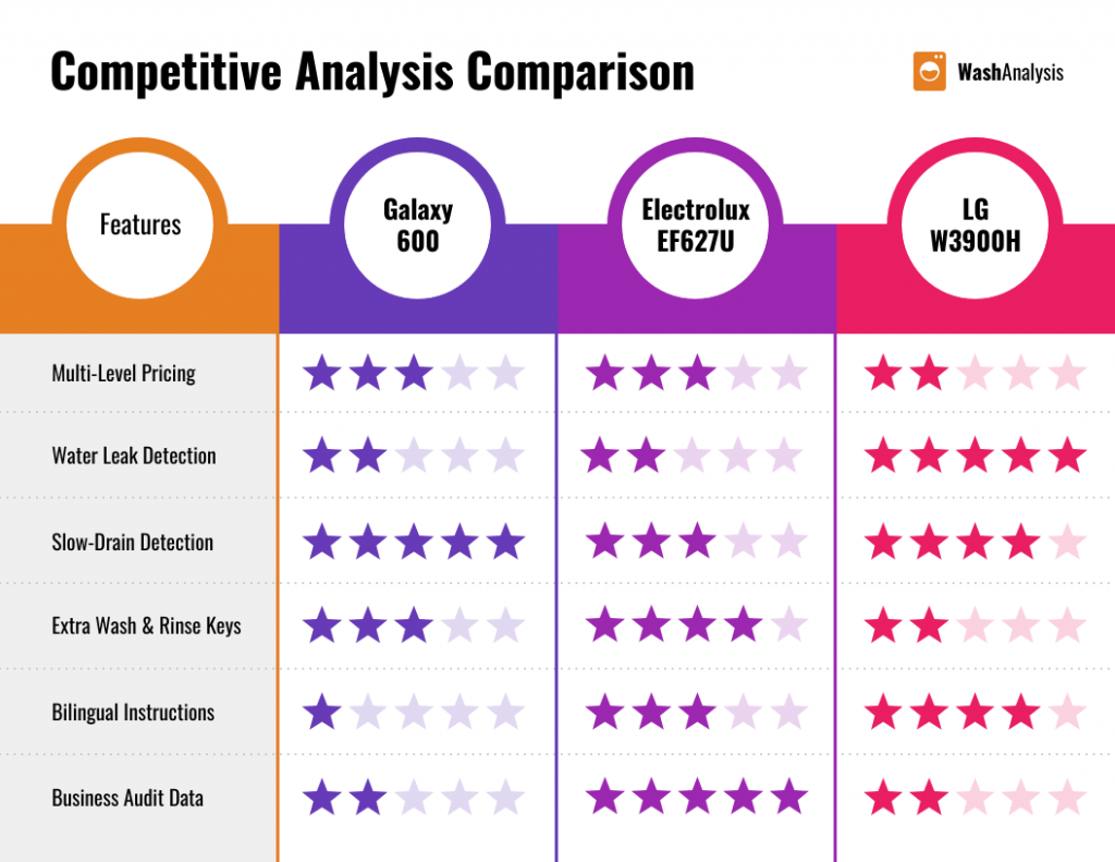
Competitor comparison infographics are useful when you want to compare two brands or products using the same performance metrics.
This example compares three washing machine models across features like pricing, water leak detection, slow-drain detection and audit data. The star ratings make it easy to scan where each product performs well and where it falls behind.
Pricing and plan comparison infographics
When you’re comparing pricing plans, the price is usually only one part of the decision. You also need to show what changes between tiers, whether that’s features, usage limits, support or access.
A pricing comparison infographic helps you put those differences side by side, so readers can quickly see what they get with each plan and which option makes the most sense for them.
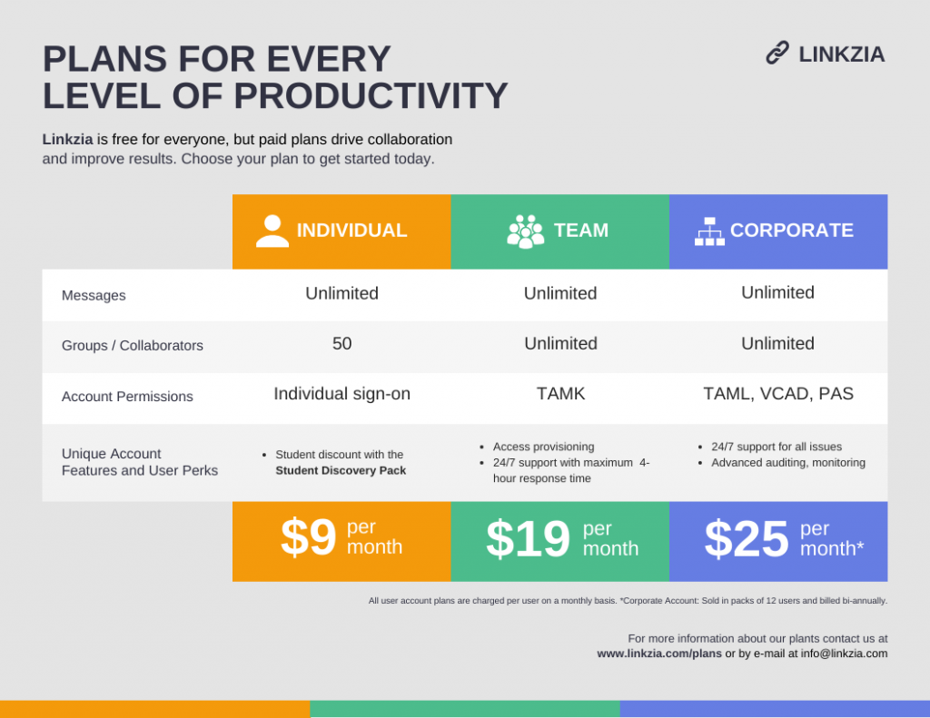
5. Subscription plan comparison infographic.
If you only have a few plans to compare, keep the layout simple. This template uses a separate column for each plan and focuses on the details people are most likely to look for first: price, user limits, permissions and key features.
6. Detailed pricing and feature comparison infographic template
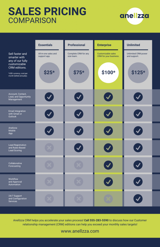
When your plans differ across several features, a comparison matrix gives you more room to show what’s included at each level. This example uses checkmarks across four pricing tiers, so readers can scan down the feature list and see exactly what changes as the price increases.
Pros and cons comparison infographics
Pros and cons infographics are useful when you want to show the positive and negative sides of an idea, option or decision in one view. The clearest ones usually keep both sides balanced, use the same criteria where possible and make the contrast obvious through labels, icons or color.
7. Positive vs. negative effects infographic
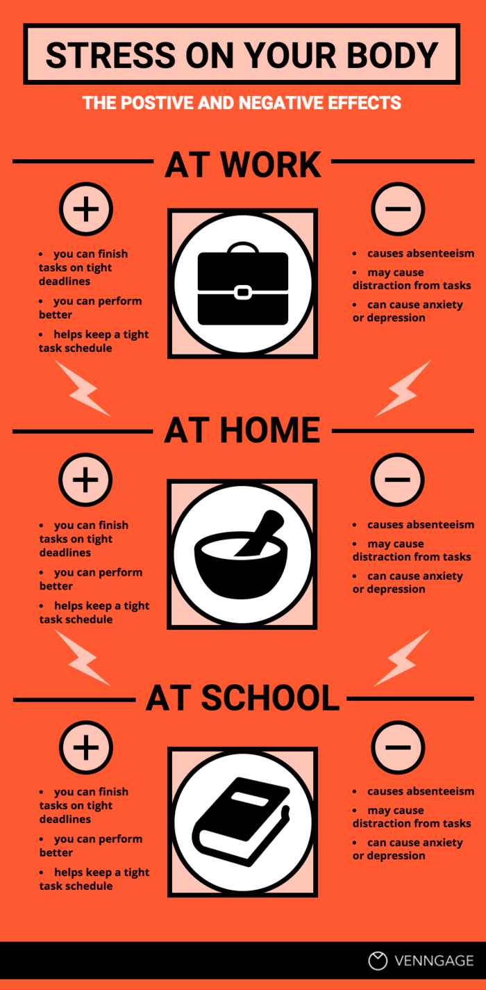
This example compares the positive and negative effects of stress across work, home and school. This infographic layout gives you two ways to read it: across the page to compare positive vs. negative effects, or down the page to compare the three settings.
Each section follows the same structure, with plus and minus icons making the two sides easy to scan. This template shows how you can use icons in comparison templates to visualize ideas and make specific text points stand out.
8. Do vs. don’t comparison infographic
Using the right colors can make a comparison infographic look better. Research on visual content found that color can act as an attention cue and encourage people to process the information more closely.
That works well for good vs. bad comparisons like this one. Green separates the topics HR should focus on, while red is used for the ones it should move away from.

Data comparison infographics
Data comparison infographics work best when you want readers to spot differences between numbers, trends or categories quickly. Instead of listing the figures in a table, you can use charts for data visualization.
9. Bar graph comparison infographic template
If you’re concerned about overcomplicating your design, it’s perfectly fine to play it safe. A classic bar graph is a great way to compare data. Plus, there are still ways you can make the design more engaging than your typical Excel chart.
For example, emphasize certain data points with a different color. Or decorate your graph with icons that help to visualize the data:

10. Year-over-year data comparison infographic
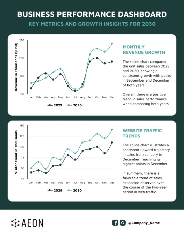
This infographic design compares business performance across 2029 and 2030 using two line charts for revenue and website traffic. Because both years are plotted on the same chart, you can see where performance improved, dipped or followed a similar pattern month by month.
It also adds a short takeaway beside each chart, which helps readers understand what the data is showing instead of leaving them to interpret the lines on their own.
11. Financial data comparison infographic
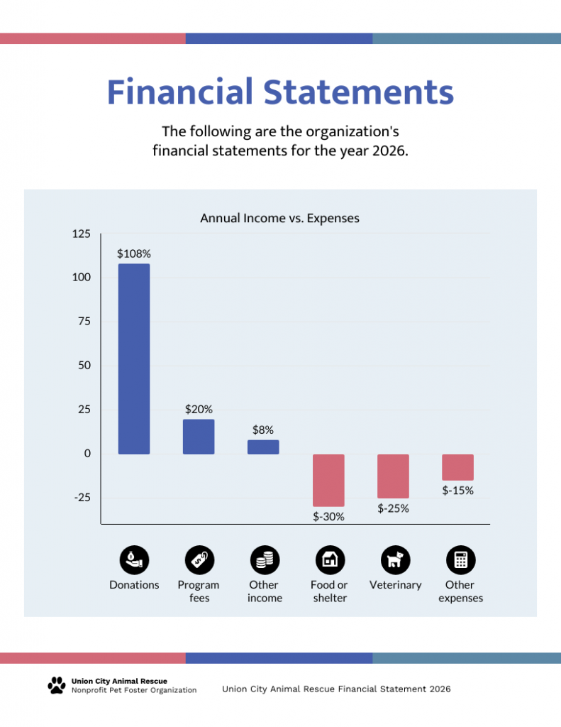
This financial statement infographic compares income and expenses on the same chart, with positive values above the baseline and expenses below it. That makes the overall balance easy to understand before you even look at the individual numbers.
The icons underneath also help separate each income and expense category without adding more labels to the chart.
12. Numerical comparison infographic
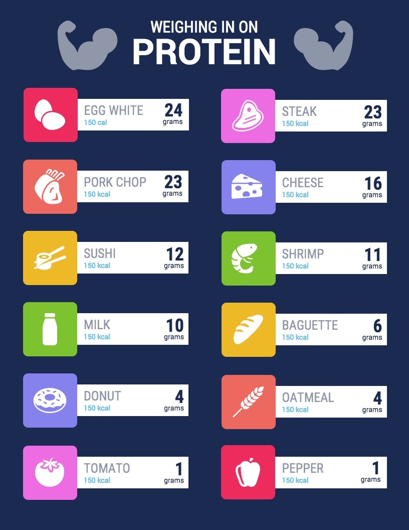
If you want to draw attention to specific numbers or statistics, then write those numbers in a bigger font that your other body text. You can also use a contrasting color to help them really pop out from the page.
For example, in this side by side comparison template comparing protein content in foods, the grams of protein are emphasized using a big, dark font that contrasts with the white background:
13. Pie chart comparison infographic template
Perhaps you want to compare the same metric across different user segments, different channels, or different time period. Using the same type of chart to compare data can highlight the differences.
For example, this comparison infographic template uses a pie chart to compare four customer segments.

14. Slider scale comparison infographic
If you want to compare customer satisfaction, or preferences, or opinions on a topic, then there’s a good chance the answers won’t be black or white. Instead, people may fall somewhere in the middle.
A slider rating scale allows you to get an exact percentage rating. That’s why it’s often considered a more accurate way of rating customer experiences, as opposed to, say, simply asking people to rate something on a scale of 1-5.
For example, this comparison infographic uses a slider rating scale to show where people stand in some of pizza’s most hotly debated topics:

Concept and idea comparison infographics
Not every comparison is about products or numbers. You can also use comparison infographics to explain how two ideas differ, clear up misconceptions or show where concepts overlap.
They work especially well for formats like fact vs. fiction, traditional vs. modern or similarities vs. differences.
15. Facts vs. fiction comparison infographic template
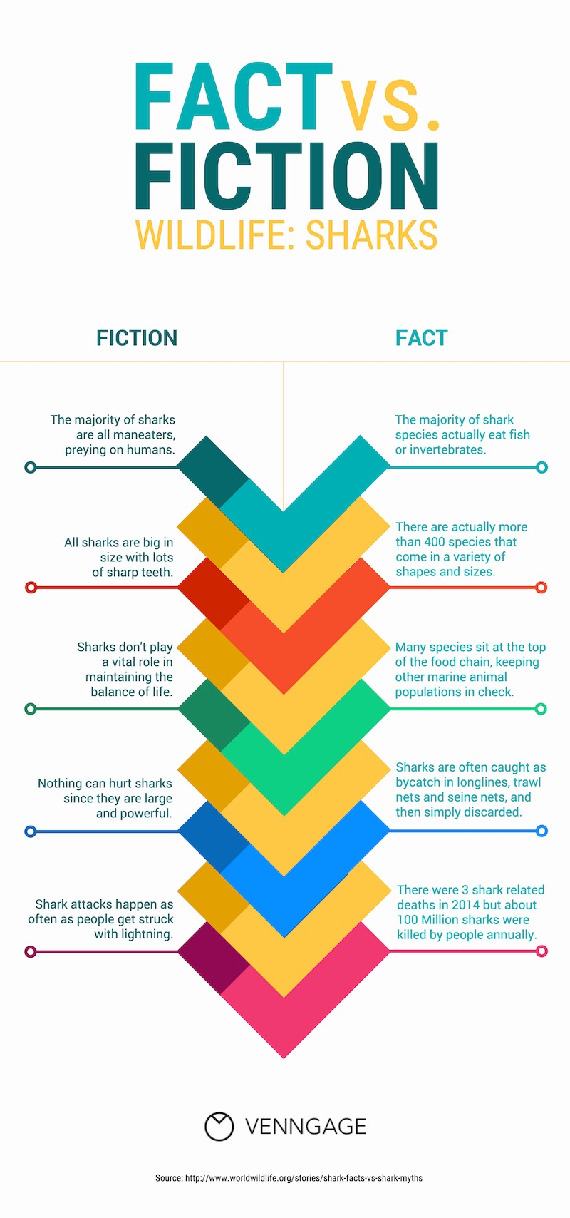
Sometimes we don’t realize how off a piece of information is until we see it next to the truth. That’s where comparison infographics come in.
They’re great for educating, easy to share on social media, and work well in presentations. Use a side-by-side layout to debunk myths by placing them next to facts. It’s a simple, effective way to raise awareness around misunderstood topics like this:
16. Traditional vs. modern approach comparison infographic
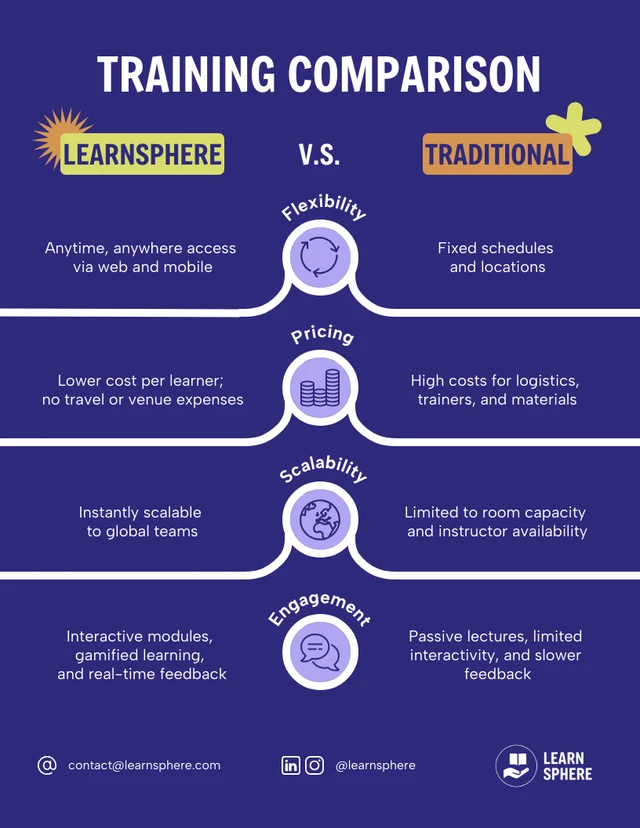
This template compares two ways of delivering training using the same criteria: flexibility, pricing, scalability and engagement. Keeping the criteria in the middle makes it easy to move across the page and see how each approach differs.
This format works well when you want to compare an older way of doing something with a newer alternative, without turning the comparison into a long list of pros and cons.
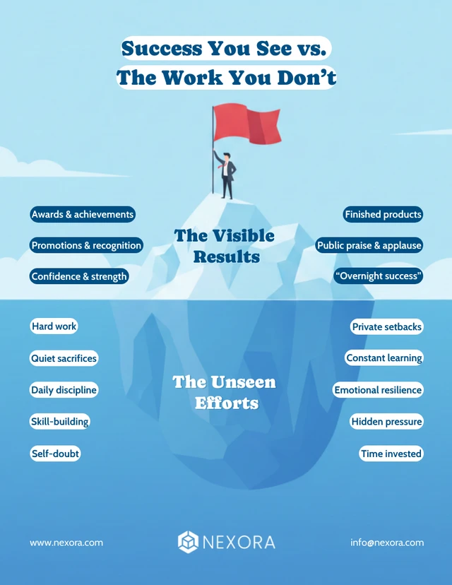
This template compares what people can see with what usually stays hidden beneath the surface. The iceberg visual does most of the work here, making the contrast between visible results and unseen effort immediately clear.
It’s a useful format when you want to compare surface-level outcomes with the factors behind them, rather than placing two options side by side.
18. Gains and losses comparison infographic template
You don’t have to stick to the usual vertical split—infographics give you room to get creative. For comparing financial gains and losses, try a horizontal layout like in the example below to emphasize the literal ups and downs. Use arrows or other directional visuals to highlight movement and draw attention to key figures.

Diagram comparison infographics
Sometimes the comparison is less about individual features and more about how two things relate, overlap or change. That’s when diagram-based comparisons work better.
You can use formats like Venn diagrams, timelines or flow-based layouts to show similarities, differences, connections or how two paths unfold side by side.
19. Venn diagram comparison infographic template
A classic Venn diagram is a great way to show where two things differ and where they overlap. If a typical Venn diagram seems too boring, you can spice it up by using brightly contrasting colors and icons.
For example, this Venn diagram template uses icons to emphasize each point in the circles:

Related:
- How to Create a Venn Diagram in PowerPoint?
- Can You Create a Venn Diagram in Word?
- How to Design a Venn Diagram in Google Docs?
20. Timeline comparison infographic template
Do you want to compare journeys for your different customer personas? Or the new employee onboarding processes for different departments?
There are a whole bunch of reason why you would want to compare timelines. That’s where a timeline template can come in handy. Use different colors for each timeline to help them stand apart. You can also use icons to code the information — to show where there are similarities, and where the different timelines diverge.

21. Quadrant comparison chart
A quadrant layout shows four options side by side. Similar to how you can use two different colors to differentiate between two options, you can use four colors to help each quadrant stand out.
Take a look at how this quadrant comparison infographic uses contrasting colors for each quadrant. Arrows also act as visual cues to indicate the direction in which the information should be read:

22. Bubble chart comparison infographic template
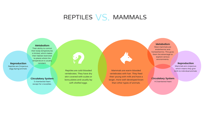
Bubbles charts are a fun and creative way to group topics together. You can create a hierarchy of information by putting the most important information in the biggest bubble and the supporting information in smaller bubbles.
For example, this comparison infographic template uses two big circles to introduce the two types of animals (reptiles and mammals), and smaller bubbles to compare their various characteristics.
How to choose the right comparison infographic format?
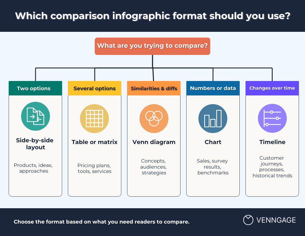
The best infographic format depends on what you’re comparing and how much information you need to show. A simple two-column layout might be enough for two options, while a table or chart works better when you have more features or data points to compare.
Here’s how you can pick the best comparison infographic templates:
1. Side-by-side layout for two options
If you’re comparing two products, ideas or approaches, a side-by-side layout is usually the easiest to follow. Keep the same criteria on both sides so readers can move across the page and spot the differences quickly.
2. Table or matrix for several features
When you need to compare several products, plans or services across the same features, use a table or matrix. It gives each option the same amount of space and keeps the criteria consistent across the comparison.
3. Venn diagram for similarities and differences
A Venn diagram works well when the overlap matters just as much as the differences. Use the outer sections for unique traits and the middle section for what both options share.
4. Charts for numerical comparisons
If the comparison is mostly about numbers, use a chart instead of listing every figure. Bar charts work well for comparing values across categories, while line charts are better for showing how two datasets change over time.
5. Timeline for changes over time
Use a timeline when you want to compare how two journeys, processes or trends unfold over the same period. Different colors can help readers follow each path and see where they line up or start to diverge.
How to make a comparison infographic with Venngage?
Creating a product comparison chart can feel overwhelming, especially when you’re trying to present key differences clearly and professionally. That’s where Venngage can help. Our templates and design tools simplify the process so you can focus on making informed comparisons your audience can trust.
Here’s a step-by-step guide to create a comparison infographic in Venngage:
Step 1: Start with a comparison template or AI-generated draft
If you already know the format you need, choose a comparison infographic template that matches it, such as a side-by-side comparison, pricing table, Venn diagram or chart-based layout.
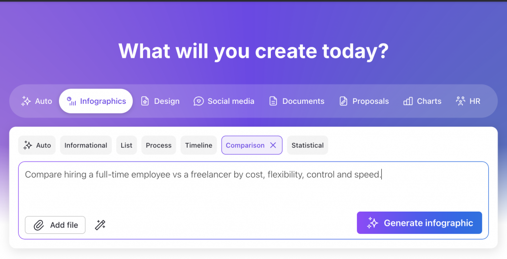
But you only have the content and are not sure which format would work best, you can use Venngage AI Infographic Generator. Add a simple text prompt with the items you want to compare and the criteria you want to use, and it will generate a first draft for you.
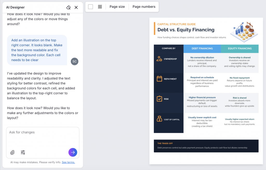
For example, I tried this prompt: “Compare debt financing vs equity financing by ownership, repayment, risk and cost of capital.”
Venngage AI generated a table comparison infographic along with relevant content.

Step 2: Replace the content and refine the design
Now you can refine the infographic design manually or with AI. Simply chat with AI Designer to make the changes. For example, you can paste your data and ask it to replace the existing infographic text. You can also ask the AI designer to suggest different layouts, themes, color palettes, make the design more engaging, add footer etc.
I instructed the AI Designer to add an illustration to cover the blank space and make the text more readable. Here’s how it turned out.
Here are a few other ways you can edit the infographic in Venngage:
- Improve or shorten the text using the AI Writing Assistant
- Add images or icons with the AI Icon Generator and AI Image Generator
- Apply your brand logo, color palette and font in one click with Branding Automation feature
Step 3: Export the comparison infographic
Before exporting, make sure you’re using the same criteria for each option and that the differences are clear even when someone only scans the infographic.
Then export or share the finished comparison in the format you need.
Comparison infographics FAQ
1. What is an example of a comparison infographic?
A product comparison infographic is a common example. You might compare two laptops by price, battery life, storage and performance, or compare several pricing plans by features and usage limits.
Comparison infographics can also be used for pros and cons, data, concepts, timelines and before-and-after results.
2. How do you make a comparison infographic?
Start by deciding what you want to compare and choose the criteria you’ll use for each option. Then pick a format that fits the information, such as a side-by-side layout for two options, a table for several features or a chart for numerical data.
From there, keep the structure consistent and use color, icons or charts to make the differences easier to spot.
3. What is the best chart for comparing two things?
For simple numerical comparisons, a bar chart is usually the easiest to read because you can see the difference between two values quickly.
If you’re comparing features rather than numbers, a side-by-side layout or table will usually work better. For similarities and differences, use a Venn diagram.
4. What should I include in a product comparison infographic?
Include the criteria people actually use to evaluate the products, such as price, features, specifications, benefits or best use case.
Use the same criteria for every product so readers can compare them fairly, and focus on the differences that are most useful for making a decision.
5. Where can I find comparison infographic templates?
Venngage has comparison infographic templates for product comparisons, pricing plans, pros and cons, data comparisons and other formats. You can customize an existing template or use Venngage AI to generate a first draft from a simple prompt.
Conclusion
Comparison infographics are not only useful in comparing and guiding your customers’ decisions — you can use these in training documents (showing how different departments can use the same tool), marketing materials (when you’re summarizing a blog post, for example), employee handbooks (comparing different tiers of company benefits), and more.
It’s easy to create a comparison infographic or product comparison chart with Venngage. Try our comparison infographic templates or use the AI Infographic Generator. No design experience required!
Learn how to design other types of infographics: