


The evolution of infographics throughout history is rich and fascinating. We’ve been trying to pass on our stories in a visual form since the first cave people learned how to draw on the walls of their humble homes.
To quote Michael Friendly from York University:
“Those who do not know history are doomed to repeat it. But if only we could! The history of statistical graphics reveals some graphics so breathtaking in information design and artistic beauty that it is hard to imagine how they might be reproduced today.”
With research material from the Milestone Project by Michael Friendly, we’ve created an infographic summarizing the evolution of infographics and data visualization over time. Check out the interactive version here.
Pre 1700s: Birth of Maps, Measurement and Graphics
The first ring represents a large period of time before the 1700s. The earliest forms of visualization arose from the first maps (circa 6200BC) to more complex ones to aid in the navigation and description of physical elements.
By the early 1600s, the fundamentals of measuring time, distance, surveying, map making and spacial geometry was beginning to formed and understood. The groundwork was laid and the seeds of visualization began to germinate.

1700s: Birth of Charts
By the end of this century, most of the modern charts that we know today–time series charts, line charts and bar charts had been invented. William Playfair’s seminal work, Commercial and Political Altas, was published in 1786, introducing the world to these new visual forms.

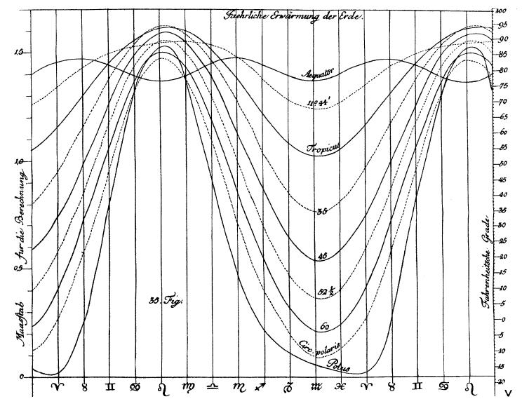
1800s: Growth of Charts and Visualization Techniques
The first half of the 1800s saw an explosion in innovation–many more of the modern forms of data visualization were invented this period: pie charts, histograms, line graphs and time-series plots, bubble charts, contour plots, and so forth.
Mapping also progressed into more complex representations such as the chloropleth map and multi-dimensional atlases.

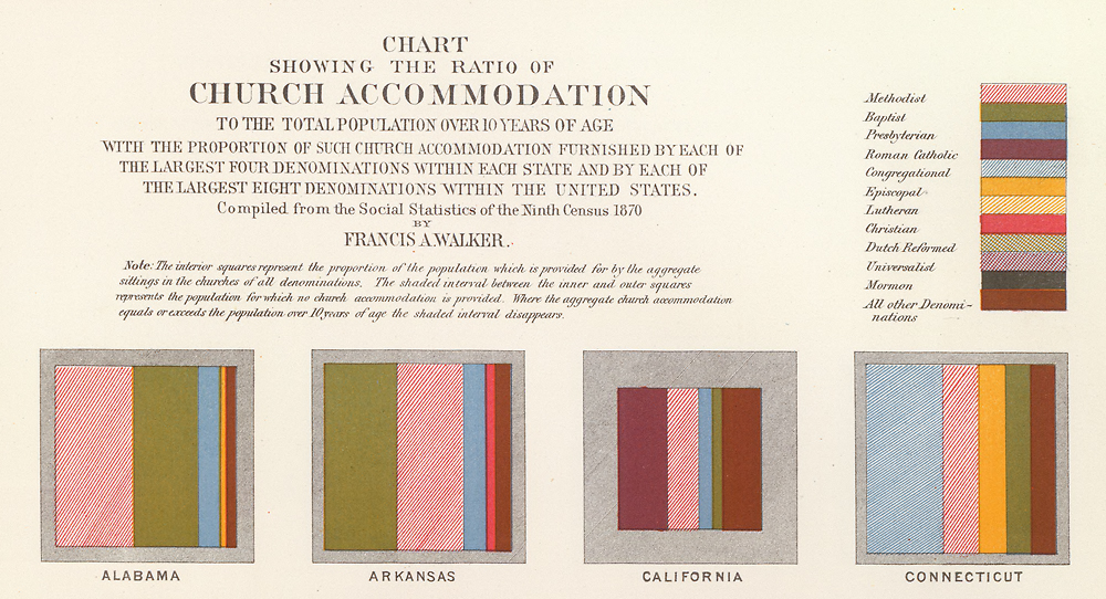
1850s+ Golden Age of Data Visualization
The second half of the 1800s was the golden age of data visualization. Many more innovations were introduced such as stacked area charts, pictograms, 3D charts and flow charts.
Examples like as Joseph Minard’s famous 1869 graphic depicting the Russian campaign of 1812 abound. This period also saw widespread adoption of these techniques in official state statistical offices.

Early 1900s: Modern Dark Ages
Compared to the previous period, the early 1900s was pretty dormant in terms of innovation. But data visualization continue to be be applied in different fields and began its popularization to the masses.

Mid 1900s: Popularization in Publications
The mid 1900s saw adoption in the mass media. Publications such as Fortune magazine, Businessweek and Popular Mechanics began to use “infographics” regularly to convey data and complex information.
This period also marked the popularization of computer generated graphics using programming languages and software tools in research labs and laboratories.

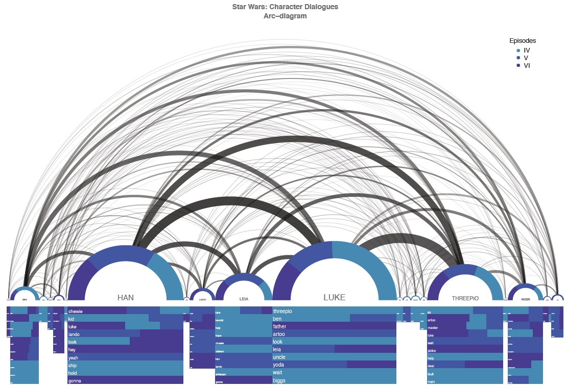
Late 1900s – Early 2000s: Acceleration Via Computer Generated Graphics
The late 1900s saw an acceleration of computer aided data visualization. With the aid of data visualization software, massive sets of data could be visualized in complex forms, no longer limited by traditional barriers of hand drawn techniques of graphing.
Modern visualization techniques fuelled by software flourished, such as network graphs, dendrograms, sunburst charts and chord diagrams.

2000s: Ubiquity on Internet
The last decade saw an explosion of infographics on the internet. No sector was left untouched by this growth, from sports, to marketing, to the White House.
New types of publications emerged in the form of data journalism such as Upshot from NYT and FiveThirtyEight, to popular appeal.
Infographics and its other forms have become one of the defacto content types of the internet.

Present: New Techniques and Tools for the Internet
Today, infographics are evolving from its static image form to a more engaging and interactive format.
Examples include interactive infographics tools like Venngage, animated infographics, video infographics and explorable big data visualizations.

Here is the full infographic:


